How to change the responsive display for a column Novice Novice tutorials require no prior knowledge of any specific web programming language.
In order to change the display for a column on tablet devices, follow these steps:
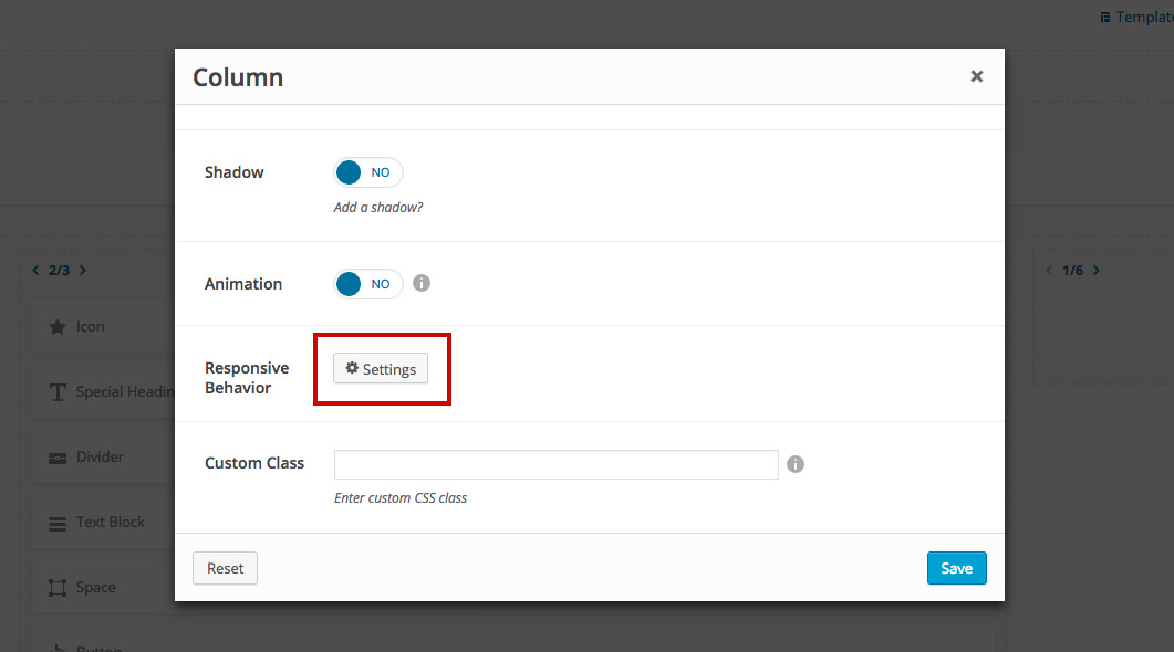
- Click a column to bring up the options pop-up and locate the Responsive Behavior option at the bottom.
- Click the Settings button.
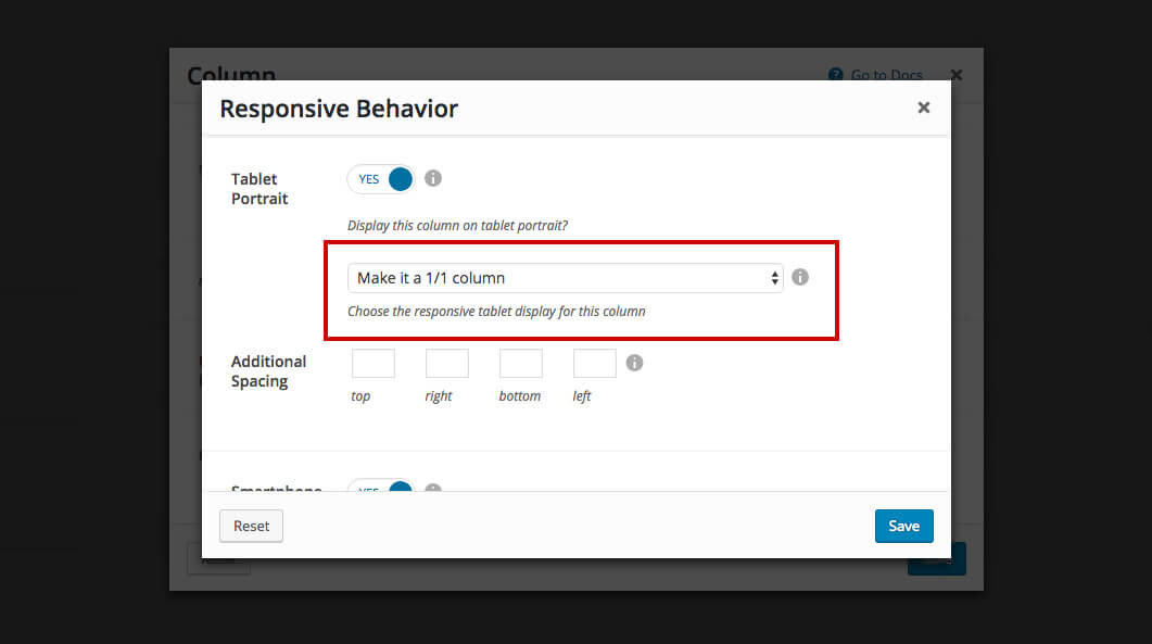
- Choose to make the column a different width on tablet portrait and hit the Save button.
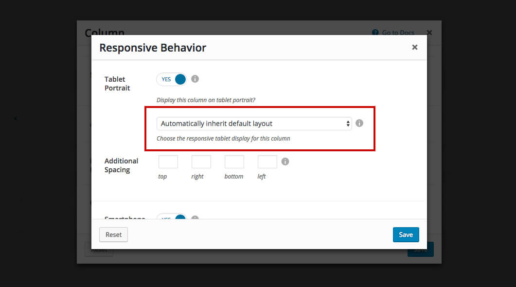
The Tablet Portrait applies only to tablets and devices with the resolution between 768px - 991px (tablet with portrait orientation). The tablets with landscape resolution are close to desktop displays nowadays so we've decided to apply this setting to tablets with portrait orientation only.
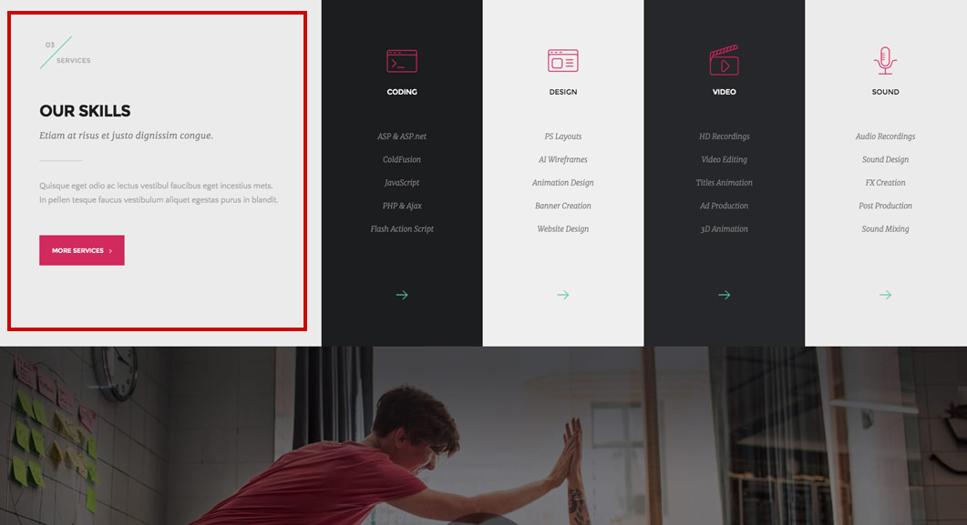
Example
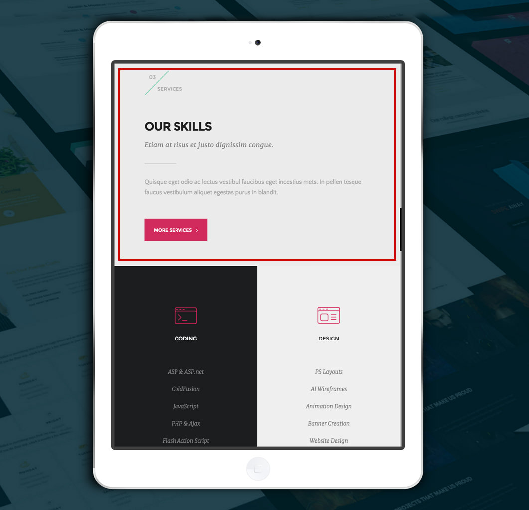
Back-end - we've set a column to be displayed as a 1/1 column on tablets (portrait orientation).
Desktop - nothing changes
Tablet (landscape orientation) - nothing changes because the tablet landscape resolution is not affected by this option.
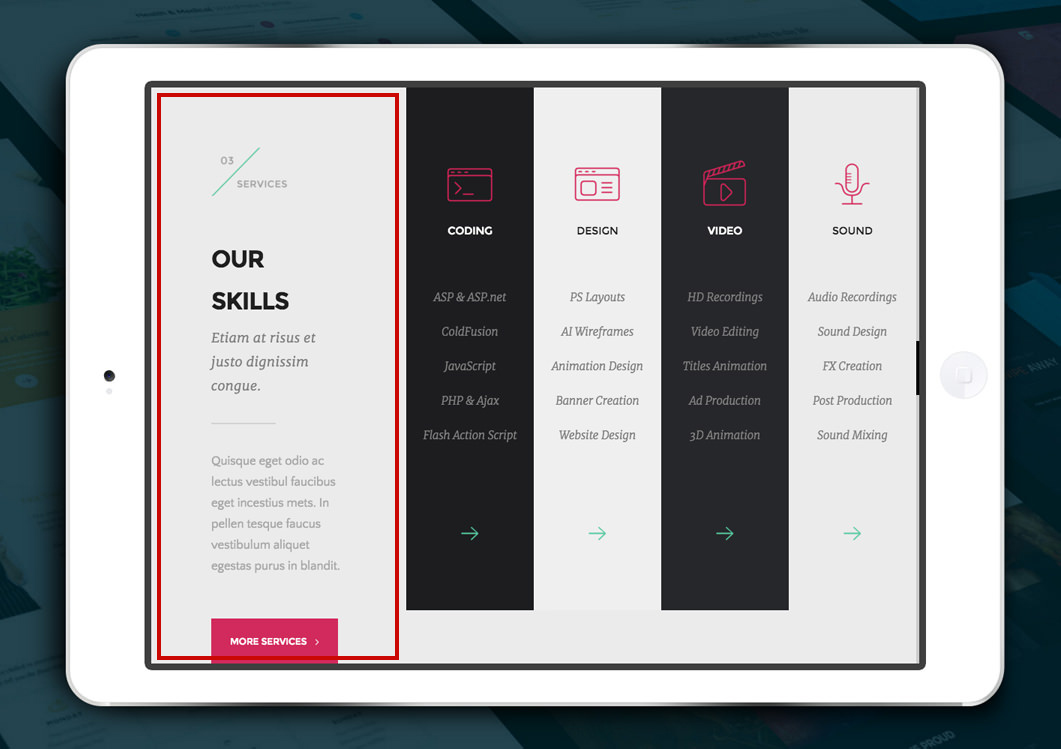
Tablet (portrait orientation) - notice that the column is now 1/1. Moreover, we've also set the following columns to be 1/2 thus you can easily see that each one occupies half the screen.