What is responsive web design? Novice Novice tutorials require no prior knowledge of any specific web programming language.
Responsive Web Design (RWD) is an approach to web design aimed at crafting sites to provide an optimal viewing and interaction experience across a wide range of devices (from desktop computer monitors to mobile phones). Basically a website should respond to the user’s behavior based on screen size, platform and orientation.
The practice consists of a mix of flexible grids and layouts, images and an intelligent use of CSS media queries. As the user switches from their laptop to iPad, the website should automatically switch to accommodate for resolution, image size and scripting abilities. In other words, the website should have the technology to automatically respond to the user’s preferences.
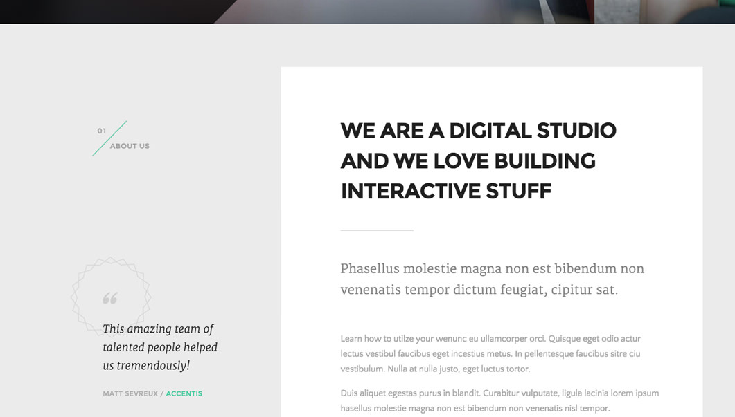
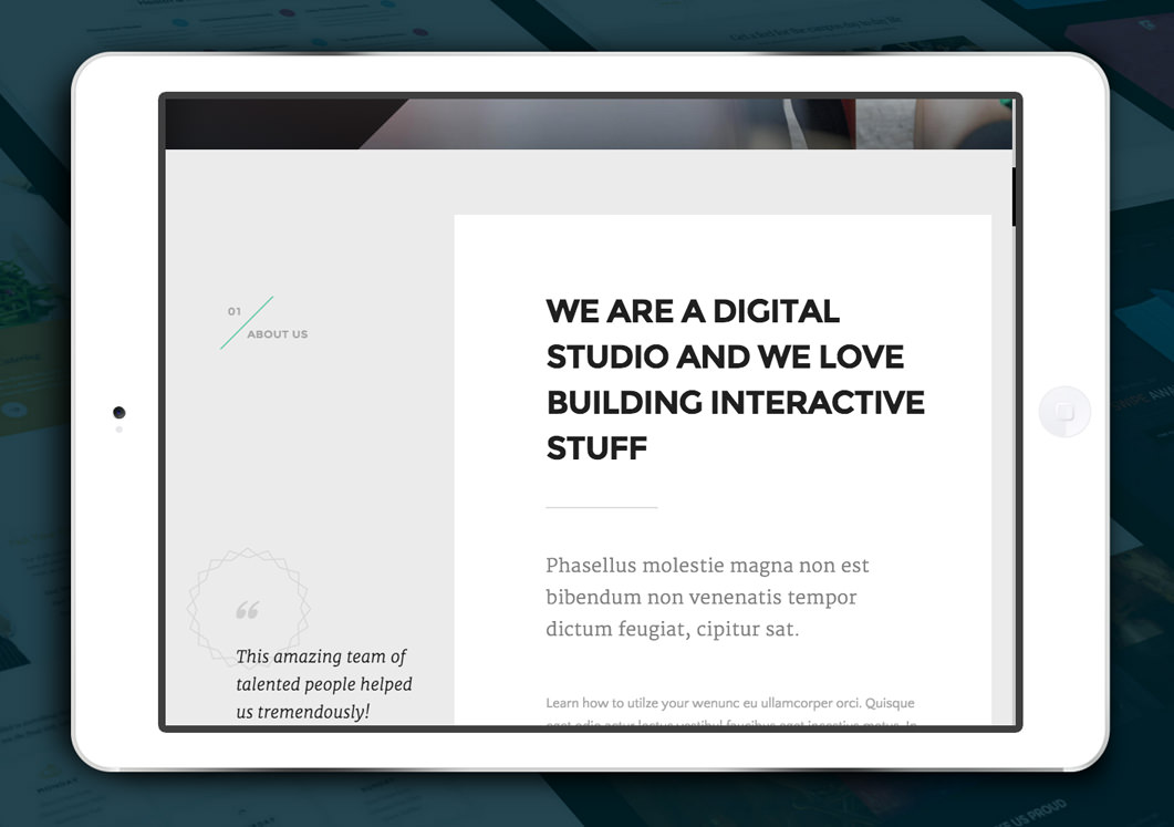
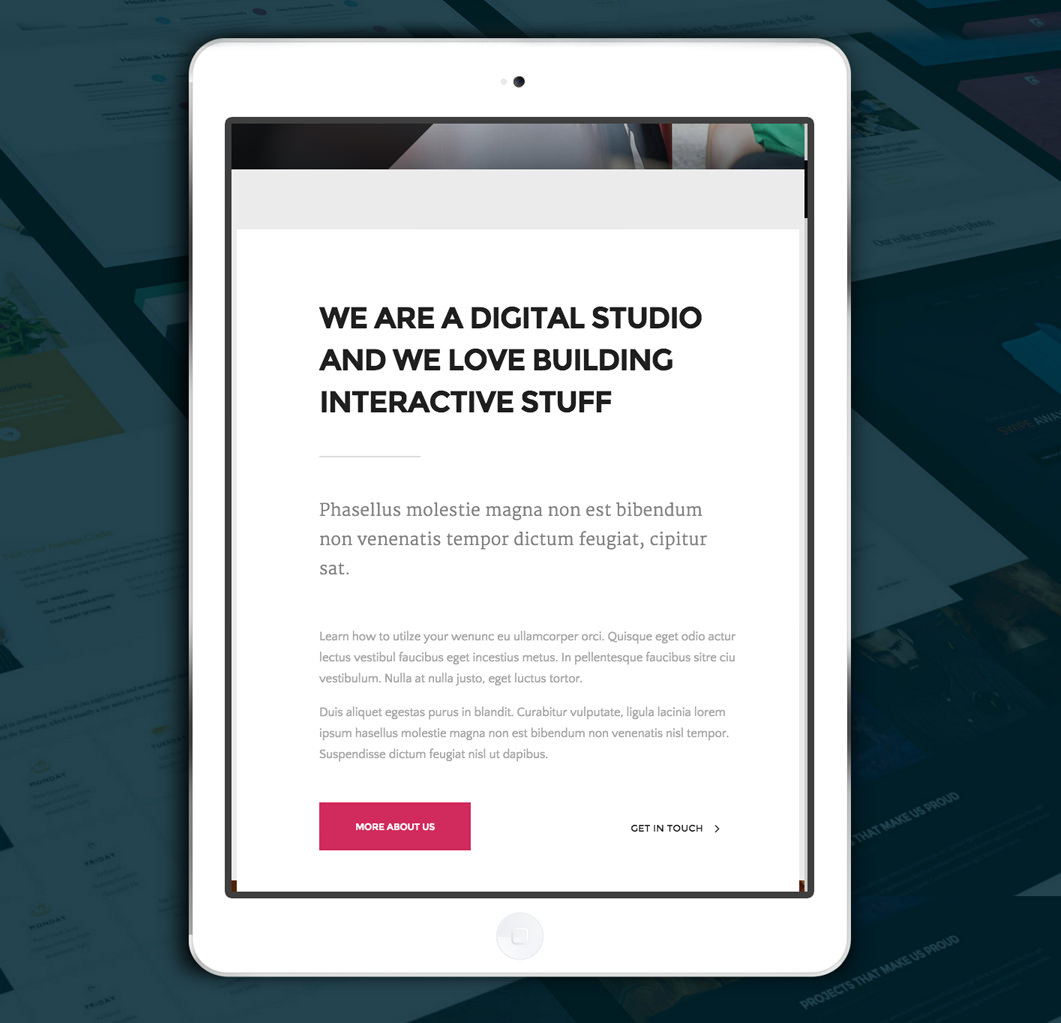
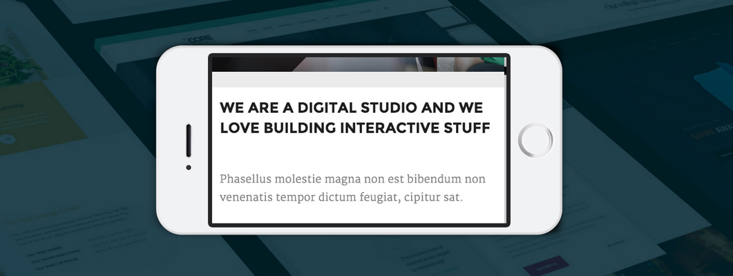
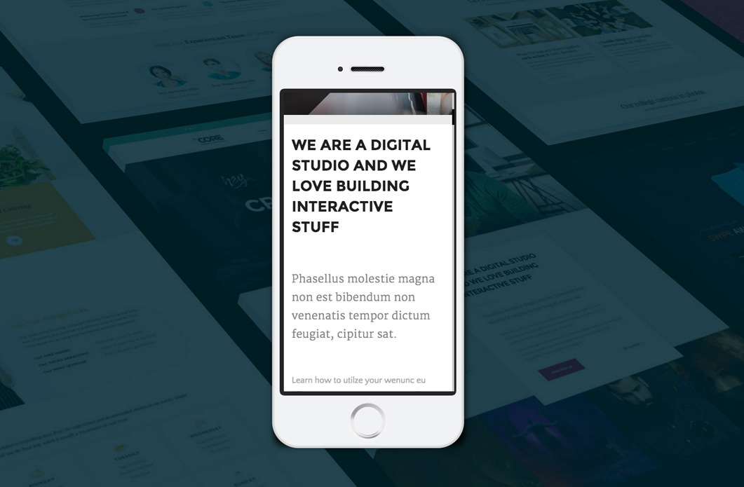
This theme has all the tools in place to let you build your website with a responsive approach in mind. Here is how a page looks on different devices:
Desktop
iPad (landscape orientation)
iPad (portrait orientation)
Smartphone (landscape orientation)
Smartphone (portrait orientation)
More about the responsive options built into the theme can be found in this article.