Global Settings Novice Novice tutorials require no prior knowledge of any specific web programming language.
The theme settings can be found under Appearance > Theme Settings. Locate the Global Settings section under General > General Tab. The page looks like this:
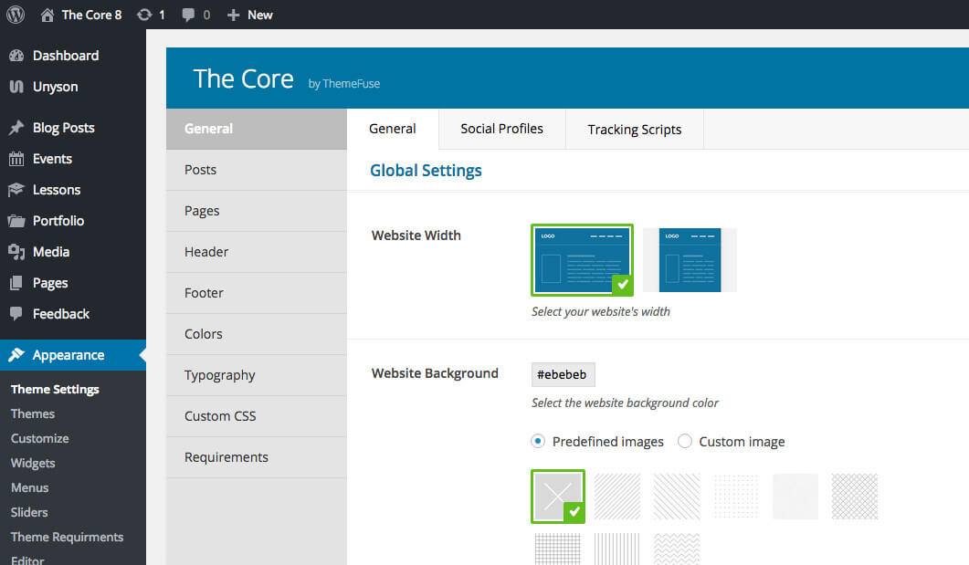
The global settings options
Here you'll find general options to control your website's width, background, logo and more. The options are as follows:
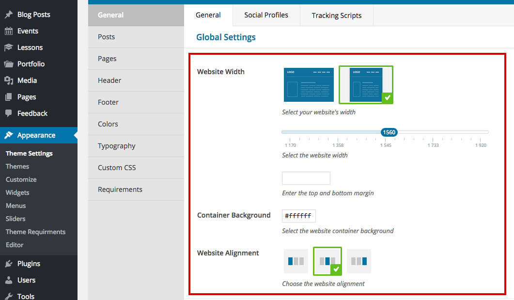
- Website Width - lets you set a custom width for your website. By default, this option is set to full width but if you select the custom option you'll be able to select the width you want from the slider, the top, and bottom margin in pixels, the container background color, and your website's alignment.
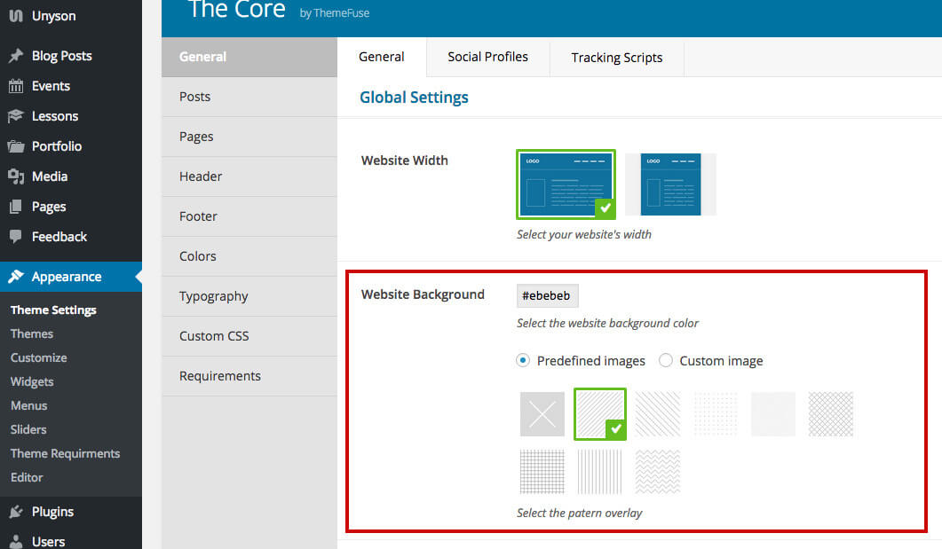
- Website Background - lets you select a background color for your website and also set a pattern overlay (choose one from the built-in options or upload your own)
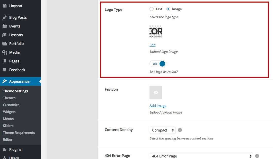
- Logo Type - lets you select the logo type: Text or Image. The image option comes with an image upload field that lets you upload a logo for your website. Upload twice the size (px) of the logo you want to use if you set the Retina option to YES.
- Favicon - upload a favicon image or favorite icon, it's visible to your users and appears here:
The Favicon option was removed from the Theme Settings page. Now you can change your favicon from the Appearance > Customize. This is the default way to change your favicon in WordPress and we choose to remove it from our settings page to avoid duplicate options.
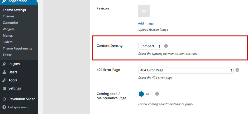
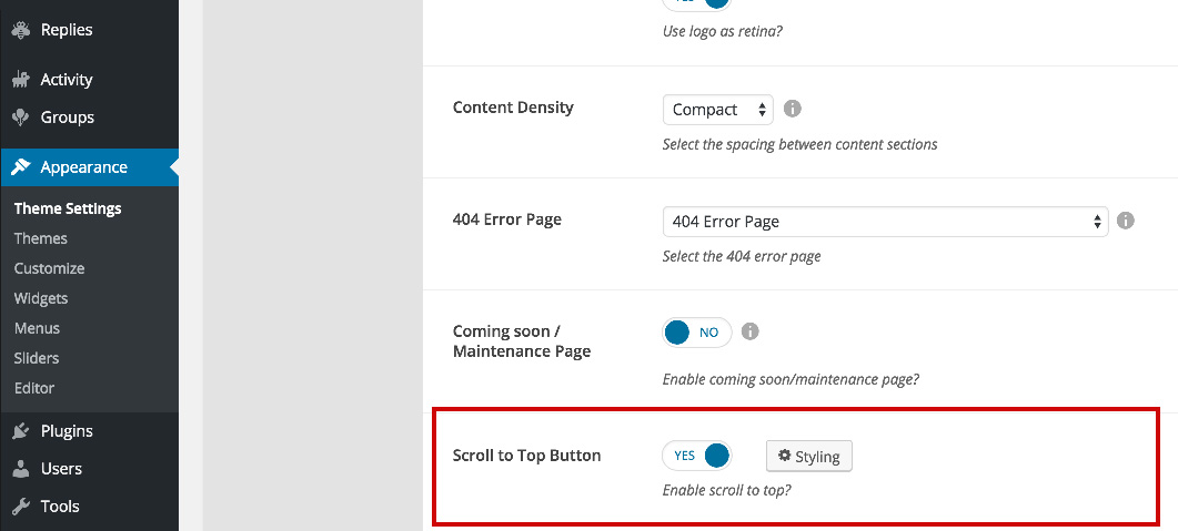
- Content Density - this option lets you choose the default top and bottom spacings built into the theme and it's related to the sections that compose the pages of your website. You can choose between: Compact (40px top and bottom), Cozy (80px top and bottom) and Comfortable (110px top and bottom). Use this option in order to have your website's sections more spaced out or less spaced out. Cozy is set up by default.
The section shortcode from the visual page builder has a Default Spacing setting tied directly with the Content Density option. You can enable or disable the Default Spacing for an individual section directly from the visual builder by setting the option to YES / NO.
The Content Density option controls only the top and bottom spacings for a section. The spaces created by shortcodes like Space, Separators, or others inside a section will not be affected by the Content Density option.
- 404 Error Page - use this option in order to select a custom 404 error page. The users will be redirected to this page when the page they are looking for is not found.
- Coming soon / Maintenance Page - lets you set a maintenance page or coming soon page.
Use this option when you want to work on your website. The users will be redirected to this page when they are not logged in.
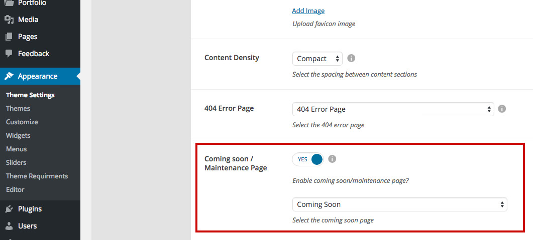
You need to disable the maintenance page manually in order to make your website accessible again.
- Scroll to Top Button - lets you set a Back to Top Button on your website. The button is displayed in the bottom right on all the pages of your website.
- Page Transition - lets you set a page transition animation when you change between the pages of your website. Press the Styling button in order to choose between different loader styles and animations.
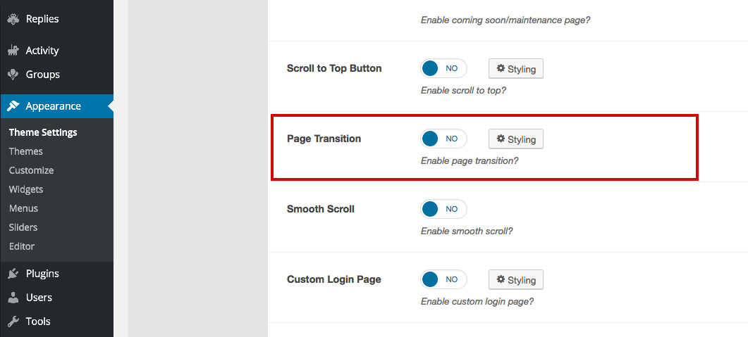
- Smooth Scroll - lets you enable the smooth scroll for your website. When you'll scroll your website using your mouse, the scroll will be very smooth. We aimed to make it the same way it is when you scroll from a trackpad on your laptop.
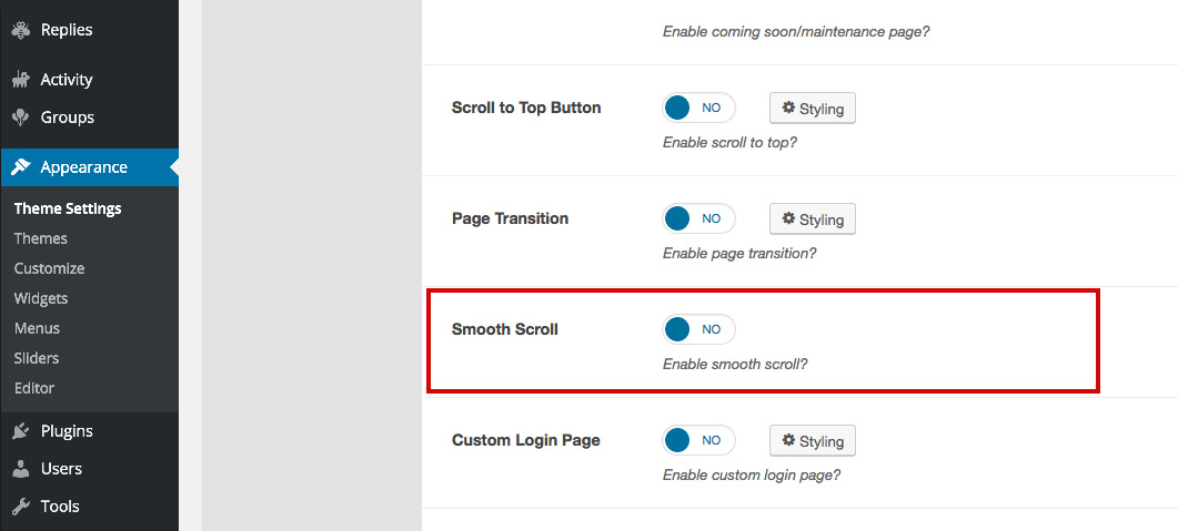
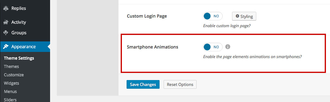
- Custom Login Page - lets you enable the use of a custom login page for your website. Press the Styling button in order to change different styling options for your custom login page.
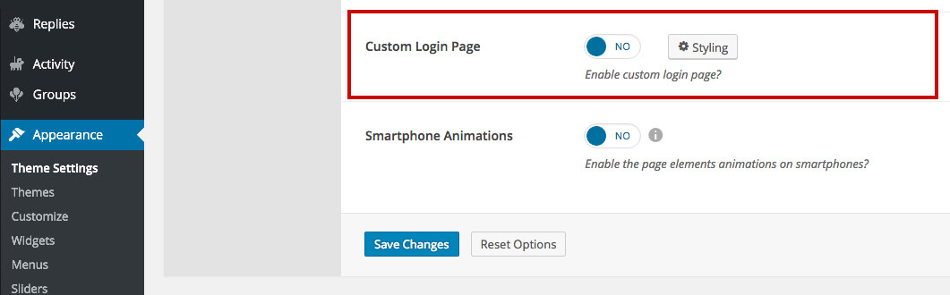
- Smartphone Animations - this option is linked to the animation settings found on the shortcodes in the visual page builder. It lets you turn ON / OFF animations for smartphones.
Having them ON might have a negative performance impact for your website on smartphones because of all the js that is handeling the animation.