How is Image Resizing Working in This Theme Intermediate Intermediate tutorials require familiarity with basic web design concepts, as well as basic knowledge of HTML, CSS and JavaScript.
When you upload an image to use in your website, we are creating a couple of instances (different sizes) of that image to use across the theme. We create these different sizes based on where the image might be used: shortcodes, blog, portfolio, etc.
If you are using this theme with your existing image content, you'll need to create the different image sizes specific for this theme by your self: follow this step by step tutorial to learn how.
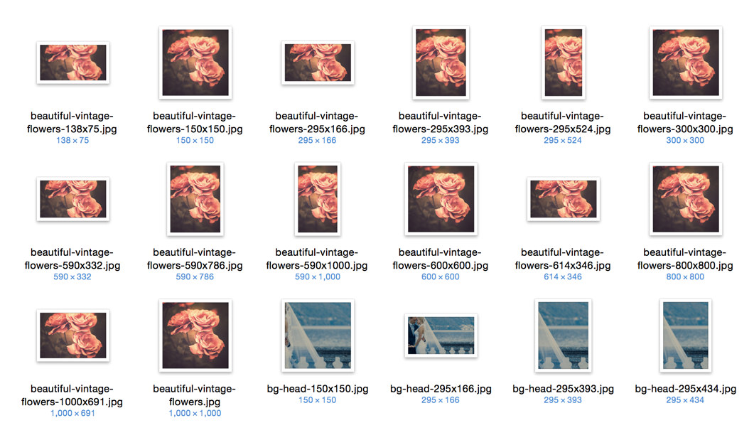
These images can't be seen in the media library, but they exist on the server. If you check your media library you'll see only the original image you have uploaded. Here is how your image folder on the server looks like:

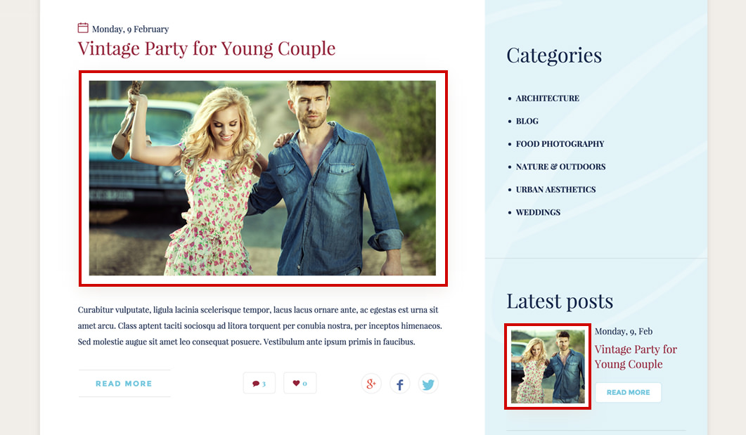
Together with the images we have a smart script that operates in the background and delivers the best image size based on the content created, resolution of the browser and device used to view the website (mobile, tablet, desktop). The retina displays are factored in as well, if the original image is large enough (resolution wise), the script will load the appropriate image for the retina display users.

The images you originally upload need to be as large as the largest image used (resolution wise). That is 1228px x 691px in this theme (the images from the blog without sidebar). If you want to cover the retina display users multiply that size with 2 and you get 2456px x 1382px. There is no problem if you don't have images that large for retina display, the script will choose the next best thing.
