The Responsive Options Novice Novice tutorials require no prior knowledge of any specific web programming language.
This theme comes with a couple of options that let you control the responsive behavior of your website on different resolutions and devices (desktops, tablets & smartphones).
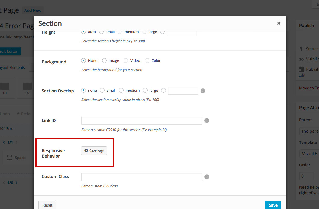
The responsive options were added to every section, column, and shortcode and can be accessed by clicking the Settings button in the options pop-up:
By using the responsive options you can:
- Turn off sections, columns, and shortcodes - lets you choose if a section, column or shortcode is displayed on desktops, tablets or smartphones.
- Change the responsive display for a column (tablet portrait only) - lets you force a column to be a certain width (1/2, 2/3, 1/1, etc) on tablet portrait only.
- Overwrite the additional spacing for a column (tablets and smartphones) - use this option to overwrite the additional spacing option for tablets and smartphones.
Important
Before continuing it's mandatory to understand the resolution ranges we've set up for the different responsive devices: Desktop (devices with the resolution higher than 1200px), Tablet Landscape (resolutions between 992px - 1199px), Tablet Portrait (resolutions between 768px - 991px), and Smartphones (resolutions up to 767px).