Columns Novice Novice tutorials require no prior knowledge of any specific web programming language.
The Columns Shortcodes are part of the backbone page structure and they come in different predefined sizes for you to use:

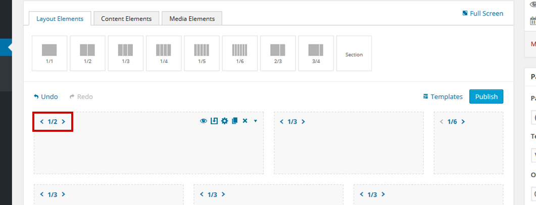
After you've added a column on the page, you can modify its size from the arrows on the left-hand side:
When you hover your mouse on any column these 4 icons will appear on the right-hand side:
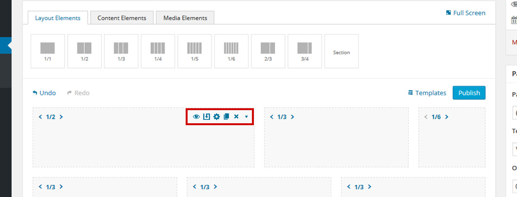
- Hide / Show - allows you to toggle the visibility of the column
- Save As Template - allows you to save the column as a template
For more information regarding templates and how to use them, check out this article.
- Edit - brings up the option pop up for the column
- Duplicate - duplicates the column and contents
- Remove - deletes the column
- Collapse - collapses the column
The column options
Every column comes with a bunch of built-in options. Click a column to bring up the options pop up:

- Default Spacing - this refers to the left and right spacings between columns. Because we use bootstrap, the default left and right spacing is set to 15px. Select NO if you want to remove this spacing for the given column.
- Additional Spacing - we've built this option to let you have full control on the column paddings. This option comes 0 by default. Here is an example of how this works:
We have this structure

that looks like this in the front end

If we add an Additional Spacing of 50 (px) to the green column, then the front end will change to this:

The additional spacing option is just that, additional spacing to the default one. So in our example above, we'll end up with 65px on the right and left, that is because we have the default spacings on (15px on each side).
- Height - this option lets you control the height of the column. The height can be Auto (the default value), in which case it will adjust according to its content, or Custom allowing you to set a fixed height.
Using Fixed Heights on columns might impact the responsive behavior of your website in a negative way. Read this article for more information and best practices.
- Background - this option will let you control the column background. You can add an image and set its position, set an overlay color and opacity, add a parallax effect. You may also set a solid color or a gradient color as the column's background.
- Border - this option lets you add a border to your column. You may control its width or color.
- Shadow - this option lets you add a shadow to your column. You may control its position, blur, size or color.
- Animation - enables you to create an animation entrance or exit for this shortcode. Demo previews for the animations can be found here.
- Responsive Behavior - lets you control how this column behaves on mobile devices as follows:

- Desktop - you may choose whether or not this column will be displayed on desktops. It applies to devices with the resolution higher than 1200px (usually desktops and laptops).

- Tablet Landscape - you may choose whether or not this column will be displayed on tablet devices with the resolution between 992px - 1199px (tablet landscape).
- Additional Spacing - this option lets you overwrite the additional spacing option for tablet landscape only. It's important to note that changing the default value will overwrite your column spacing and not add to it while leaving it blank will allow the column to inherit its spacing from the general column options.

- Tablet Portrait - you may choose whether or not this column will be displayed on tablet devices with the resolution between 768px - 991px (tablet portrait).
- Display Layout - by default, the column will inherit its original layout (width) but you may change this from the drop-down options. For example, you might want a 1/2 column to be 1/3 on tablet portrait only.
- Additional Spacing - this option lets you overwrite the additional spacing option for tablet portrait only. It's important to note that changing the default value will overwrite your column spacing and not add to it while leaving it blank will allow the column to inherit its spacing from the general column options.

- Smartphone - you may choose whether or not this column will be displayed on smartphones and devices with the resolution up to 767px (smartphones both portrait and landscape as well as some low-resolution tablets).
- Additional Spacing - this option lets you overwrite the additional spacing option for smartphones only. It's important to note that changing the default value of 0 will overwrite your column spacing and not add to it while leaving it blank will allow the column to inherit its spacing from the general column options
On smartphones, all columns are set on 1/1 (full-width) by default.
- Custom Class - you can use this option to add a class and further style the shortcode by adding your custom CSS in the Custom CSS section from Appearance > Theme Settings.