Sections Novice Novice tutorials require no prior knowledge of any specific web programming language.
The Section Shortcode is as important as the columns as it comes with a lot of nifty options that will let you create some cool and unique pages:

Note that the sections are always full width and you can drag columns inside them:

Sections can't be dragged into columns
Same as on the columns if you hover your mouse on any section these 4 icons will appear on the right-hand side:

- Hide / Show - allows you to toggle the visibility of the section
- Save As Template - allows you to save the section as a template
For more information regarding templates and how to use them, check out this article.
- Edit - brings up the option pop up for the section
- Duplicate - duplicates the section and its contents
- Remove - deletes the section
- Collapse - collapses the section
The section options
Every section comes with a bunch of built-in options. Click a section to bring up the options pop up:

- Section Name - this option allows you to name your section. This is for internal use only and it helps you go through the page structure a lot easier when you try to find something.
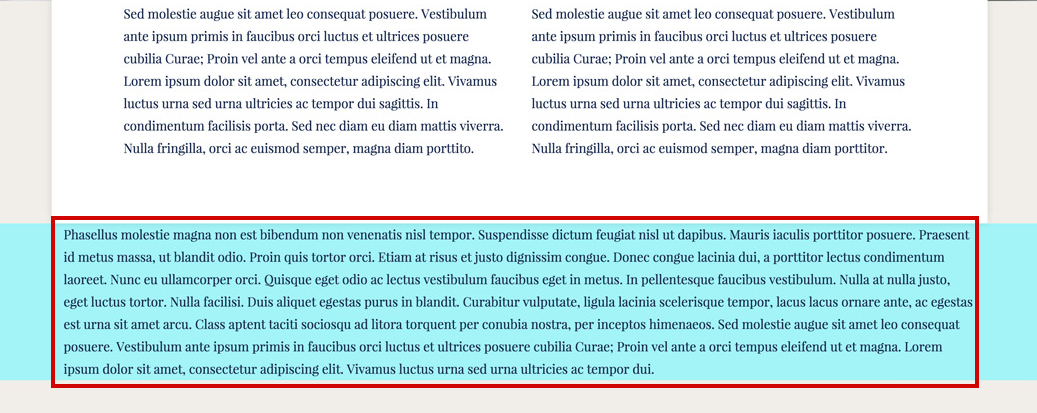
- Full Width Content - this refers to the content inside the section. If you want to make the content inside this section full-width select YES. It comes NO by default.
Full width content set to NO:

- Custom Shape - lets you choose from 8 types of premade custom shapes for your section

- Vertical Align - this option will vertically center the content inside the section.
The vertical-align option works with any number of columns as long as they are on a single row.
- Default Spacing - this option lets you choose if you want to use the default top and bottom spacings built into the theme. We've built an option called Content Density that lets you select from the 3 preset top and bottom spacings. This option can be found in Appearance > Theme Settings > General under the Global Settings section.
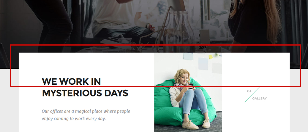
Default spacing set to NO:
- Height - this option lets you control the height of the section. The height can be Auto (the default value), in which case it will adjust according to its content, or Custom allowing you to set a fixed height. It also has 3 preset choices (small, medium and large). These presets were created in order to help you keep all your sections heights consistent across your website.
Using Fixed Heights on sections might impact the responsive behavior of your website in a negative way. Read this article for more information and best practices.
- Background - this option will let you control the section background. You can add an image and set its position, set an overlay color and opacity, add a parallax effect. You may also set a video, a solid color or a gradient color as the section's background.
- Section Overlap - this option lets you set the overlap value in pixels. The content that follows will overlap the section with the specified pixel amount. You can input a custom value or select from the 3 preset choices (small, medium and large). These presets were created in order to help you keep all your sections overlap values consistent across your website.
- Link ID - you can enter a custom CSS ID for this shortcode. Use this ID in any URL link in the page in order to anchor link to this shortcode (e.g http://link/#custom_id)
- Responsive Behavior - lets you control how this section behaves on mobile devices as follows:
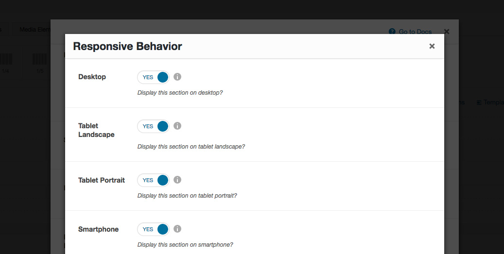
- Desktop - you may choose whether or not this section will be displayed on desktops. It applies to devices with the resolution higher than 1200px (usually desktops and laptops).
- Tablet Landscape - you may choose whether or not this section will be displayed on tablet devices with the resolution between 992px - 1199px (tablet landscape).
- Tablet Portrait - you may choose whether or not this section will be displayed on tablet devices with the resolution between 768px - 991px (tablet portrait).
- Smartphone - you may choose whether or not this section will be displayed on smartphones and devices with the resolution up to 767px (smartphones both portrait and landscape as well as some low-resolution tablets).
- Custom Class - you can use this option to add a class and further style the shortcode by adding your custom CSS in the Custom CSS section from Appearance > Theme Settings.