Columns Novice Novice tutorials require no prior knowledge of any specific web programming language.
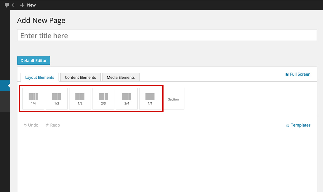
The Columns Shortcodes are part of the back bone page structure and they come in different predefined sizes for you to use:
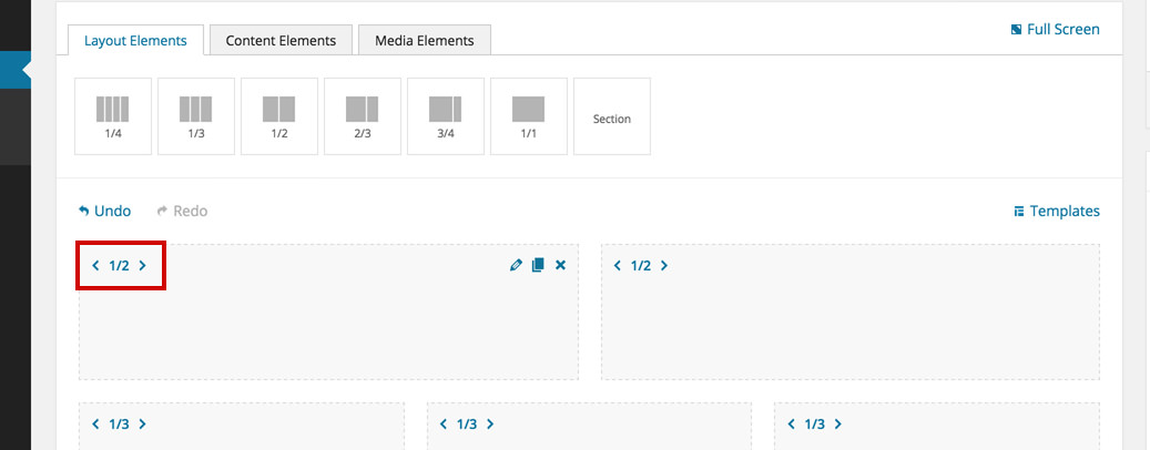
After you've added a column on the page, you can modify its size from the arrows on the left hand side:
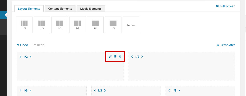
When you hover your mouse on any column these 3 icons will appear on the right hand side:
- Edit - brings up the option pop up for the column
- Duplicate - duplicates the column and contents
- Delete - deletes the column
The column options
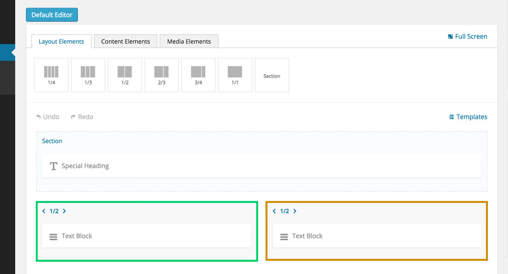
Every column comes with a bunch of built in options. Click a column to bring up the options pop up:
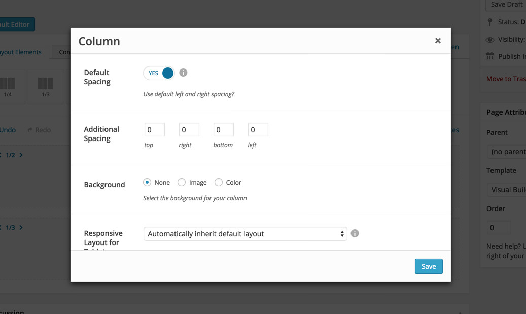
Default Spacing - this refers to the left and right spacings between columns. Because we use bootstrap, the default left and right spacing is set to 15px. Select NO if you want to remove this spacing for the given column.
Additional Spacing - we've built this option to let you have full control on the column spacings. This option comes 0 by default. Here is an example on how this works:
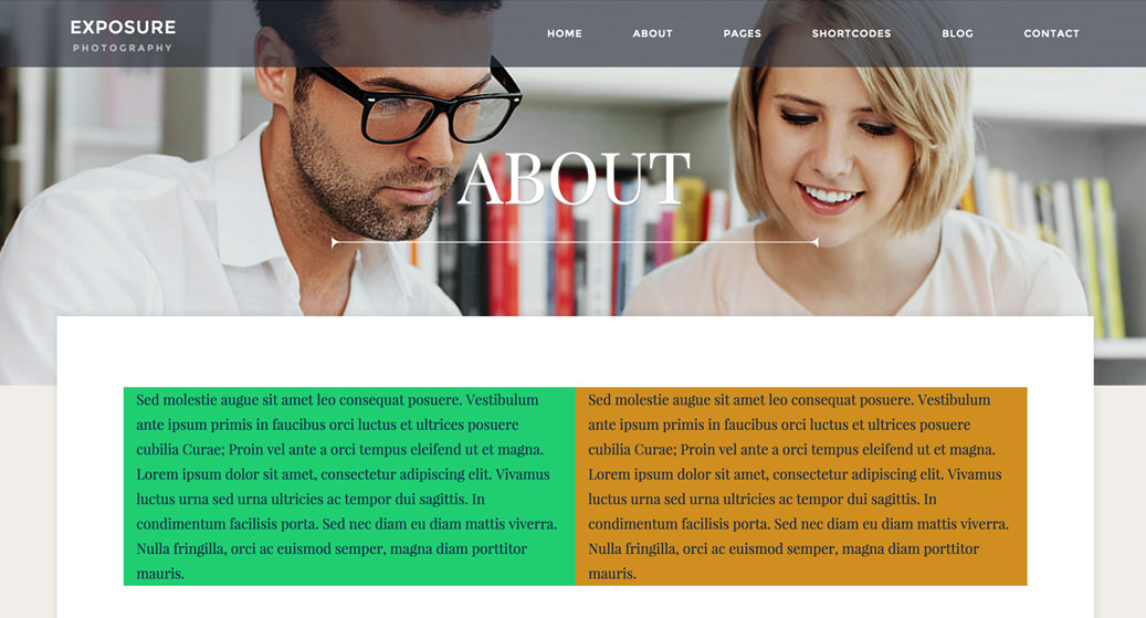
We have this structure
that looks like this in the front end
If we add an Additional Spacing of 50 (px) to the green column, then the front end will change to this:
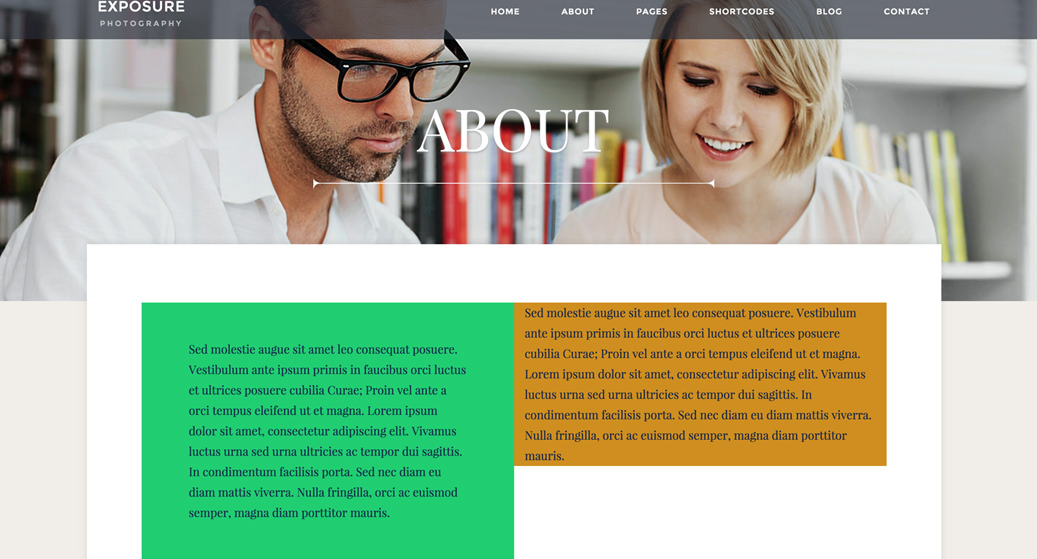
The additional spacing option is just that, additional spacing to the default one. So in our example above, we'll end up with 65px on right and left, that is because we have the default spacings on (15px on each side).
Background - this option will let you control the column background. You can add an image, set an image overlay color or a solid background color
Responsive Layout for Tablet - will let you control how this column behaves on tablets (and devices with the resolution between 768px - 990px). Note that on phones all the columns are 1/1 by default.
Custom Class - you can use this options to add a class and further style the shortcode by adding your custom CSS in the custom.less file. This file is located on your server in the /child-theme/styles-less/ folder.